Frontend interview question:
A lot of developers answer:
“Media queries are for responsive design.”
True, but incomplete.
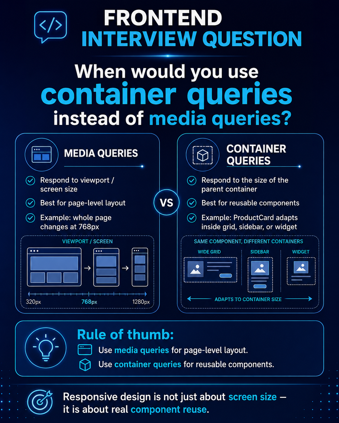
Media queries respond to the screen size.
Container queries respond to the actual size of the component’s parent/container.
That difference matters a lot when you build reusable components.
For example, imagine a ProductCard component.
On one page, it is inside a 3-column grid.
On another page, it is inside a narrow sidebar.
On another page, it is inside a dashboard widget.
The screen size may be the same, but the available space for the component is completely different.
That is where container queries are much cleaner.
Instead of asking:
“Is the viewport smaller than 768px?”
You ask:
“How much space does this component actually have?”
My rule of thumb:
Use media queries for page-level layout.
Use container queries for reusable components.
This avoids a lot of layout bugs when the same component is reused in different places.
Senior frontend development is not just about making things responsive.
It is about making components survive real-world reuse.
How would you explain this in an interview?
#FrontendDevelopment #CSS #WebDevelopment #ReactJS #Angular #VueJS #SoftwareEngineering