In 2025, two striking UI design trends are making waves in very different ways: Brutalist Design Revival and Glassmorphism. Let's dive into what makes each of them unique, how they impact performance and usability, and which one might suit your next project better.
Brutalist design comes from the architectural world of the 1950s and 60s, where raw concrete, steel, and sharp geometry defined a no-frills aesthetic. In UI, Brutalist revival focuses on:
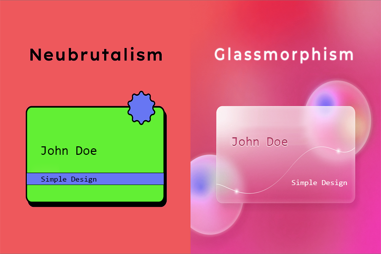
Raw, "unfinished" look
Bold, often monospaced typography
Minimal color palettes (often grayscale)
Rigid grid systems
Little to no animation or visual polish
High performance: Since Brutalist UIs use minimal styling, no shadows, and simple grids, they are super lightweight and fast to load.
Authenticity: It creates a feeling of honesty and rawness that appeals to niche, artistic, or tech-savvy audiences.
Unique identity: It helps products stand out in a world full of rounded corners and soft gradients.
Can feel harsh or unfinished to some users, especially non-designers.
Limited emotional warmth: It may lack the friendly, inviting feel many brands aim for.
Not ideal for all audiences: It often suits underground, indie, or tech-focused websites better than mainstream consumer brands.
Smashed.by by Alex Smashed uses pure Brutalism — large black text, monospaced fonts, no imagery, no gradients — and it feels like a personal statement.
Bloomberg.com also flirts with Brutalist elements: dense grids, minimal visual distraction, and fast load times.
Brutalist UIs are easier to implement from a frontend perspective. Less CSS, fewer images, no shadows or blur filters — just layout, text, and spacing.
Glassmorphism is a visual style that creates a frosted-glass effect using blur and transparency. It brings a feeling of depth and layering, using:
Semi-transparent containers
Backdrop blur filters
Soft shadows and borders
Bright, often neon accent colors
Modern and stylish: It looks sleek and premium, ideal for fintech, SaaS, or modern apps.
Depth and layering: It helps users understand hierarchy and relationships between elements.
Emotionally appealing: Soft visuals create a clean and pleasant user experience.
Performance-heavy: The blur and transparency effects require GPU rendering and can slow down older devices.
Accessibility issues: Translucent backgrounds may cause contrast problems, especially for users with visual impairments.
Harder to implement consistently: It needs more CSS, fallbacks, and testing across browsers.
Apple iOS: The Notification Center and Control Center use Glassmorphism extensively.
macOS Big Sur introduced system-wide glassmorphism and was praised for its elegance.
Stripe.com uses light blur effects and glassy containers in parts of its UI, enhancing clarity and visual appeal.
Glassmorphism is harder to implement due to its reliance on CSS backdrop-filter, layering techniques, and performance tuning. Also, support across all browsers is not 100% consistent (especially on older Android versions).